Here it is, a new shiny development company. If you are interested in how it was established, then continue on reading.
It was probably exactly the same as it has been for thousands of other companies – a few guys came together with an idea to combine their strengths and huge variety of skills to earn some extra money. Before doing all that there were few steps we had to take.
Purpose of the company
This part was not difficult at all. We all already knew what we wanted to do – application development and consulting. The first rule we agreed to was that working has to be fun. That meant we could decide which projects to accept and which ones to reject. It is no secret that you do an excellent job if you actually like what you are doing – you put a piece of yourself into the project and really care about your “pet”. I’m sure all our clients will appreciate this. The first rule led us to the second one – preferring general development over regular web/homepages.We like to do both, but custom built solutions, tailored for each customer, bring more excitement and more individual growth to each member of the company.
Name of the company
Choosing a name took approximately 3-4 hours. All those lovely names we came up were already taken or were too similar to others. We even tried a random name generator without luck. Still, we got a good laugh with that. So, we wanted something meaningful. Surely names like “High Hopes” described very well how we feel about our company, but those are more suitable for other fields, perhaps for a religious e-shop or a cannabis dispensary. Next, for a moment, we thought we liked the idea of inserting our national identity to our company name. We tried to combine words like “code” and “Estonia”, which got us many options like CodEst, BestEst etc. We realised the word “code” should be replaced with “development” because we do more than just writing code. Still, not all of us were satisfied. Finally, we started taking nouns and combining them with the word “dev”. That is how “devbreak” was born from the phrase “daybreak”. How we see it, “devbreak” does not mean to take a break from development, but rather it is the exact moment when something wonderful starts. Like a coffee-break that everyone loves.
Logo
What pure joy this was. We opened a logo contest in freelancer.com for almost the minimum prize amount. Our contest description was very short, something like: “The required logo must look simple but elegant, no bright colors etc”. It did not take long for the results to start coming in, the first one was posted within minutes and they kept coming. Here are just a few examples:
Number 1
That was the first logo. It was probably generated by some stamp example engine like many others we got but we were almost in love with that already.
Number 2

That one we did not like – too bright, too sparse. It is polite to leave a comment to the designer. So we did that. Ohh, boy, we just encouraged him. He started to post the same logo with many color variations. That was not our intention at all.
Number 3
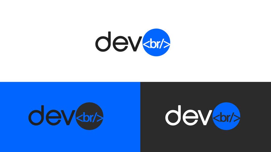
If we had a special price only for the idea, then this logo would win that. Unfortunately, not all potential clients know the html break tag. That logo would have been too cryptic. But yeah, the idea was extremely good for us, IT people.
Number 4
Only for a comic book cover not for a decent dev company.
Number 5
Can you read out the name of the company here? Is it DEV or DEN something?
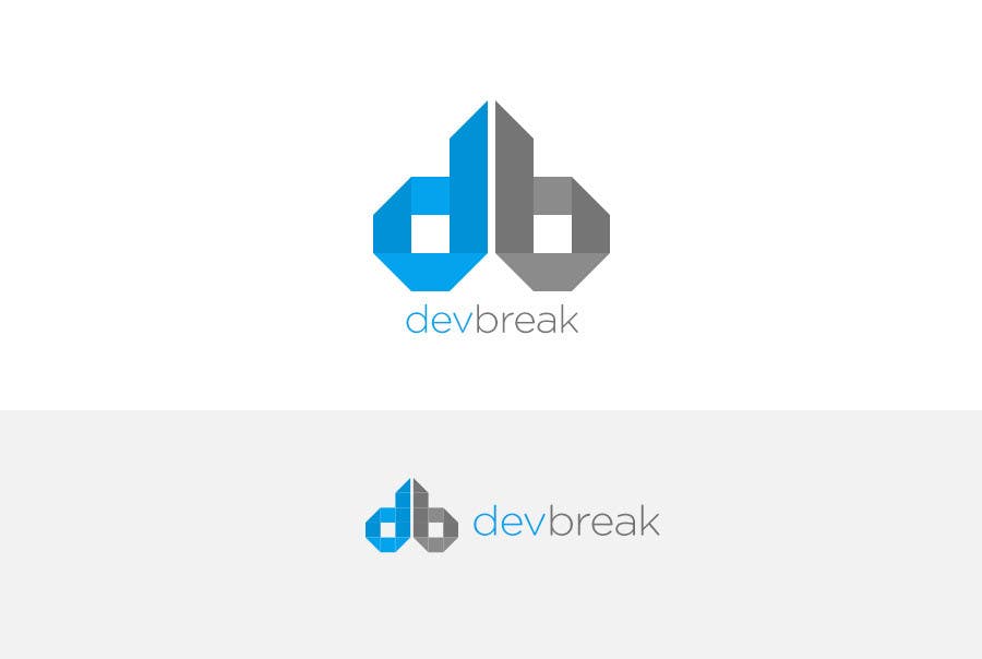
Number 6
At first it looked very nice, but after looking at it for a while I couldn’t get away from the feeling that the DB part displays a face of a cartoon animal. Just rotate it -90° and you see eyes and a big open mouth. That made me want to reject all logos where DB was pictured.
Number 7
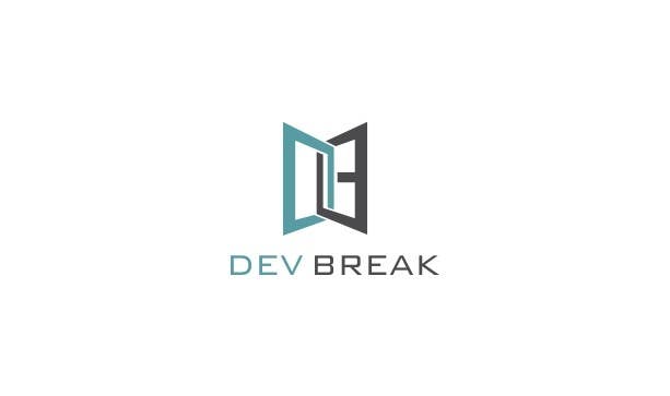
These two were more suitable for a company that deals with doors or windows.
Number 8
We rejected all logos where the characters “d” and “b” were together. That result resembled something inappropriate. In one design these letters were even connected with a top curve. It was so obvious and awful that we cannot display it here, sorry.
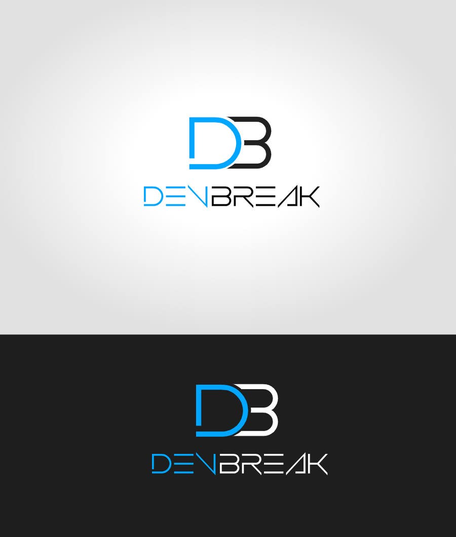
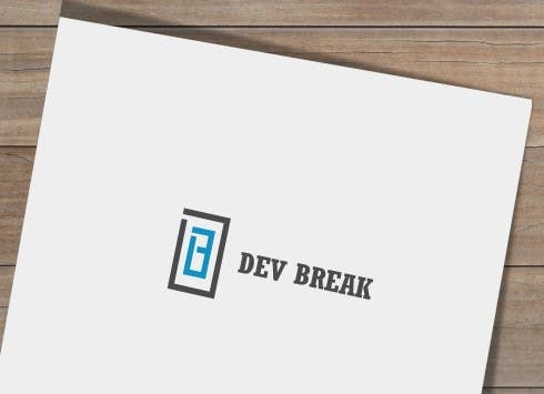
Number 9
This was our second choice. It looked smooth and a little bit rubber-like, making you want to swipe your hand over the design and feel it. Definitely the background here played a huge role.
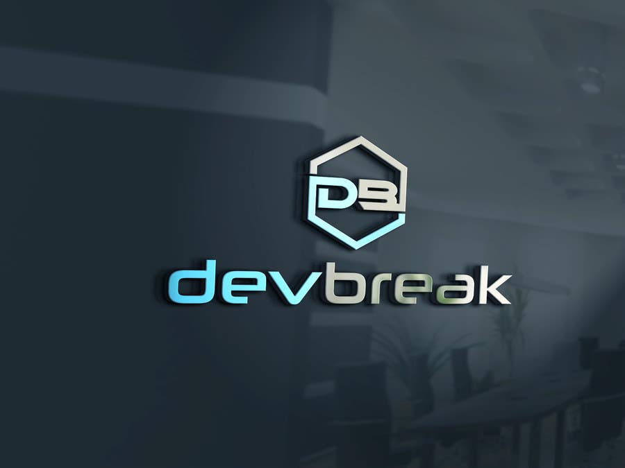
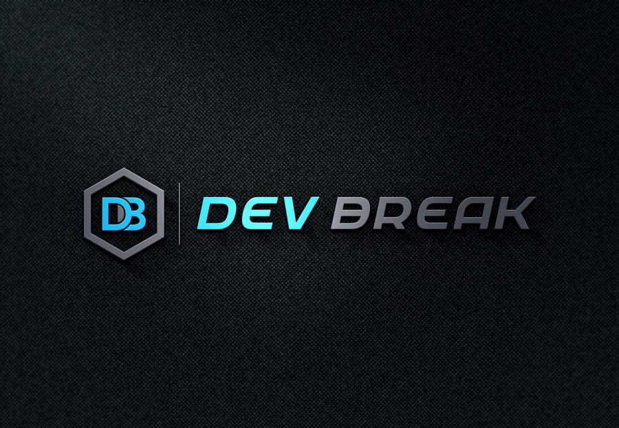
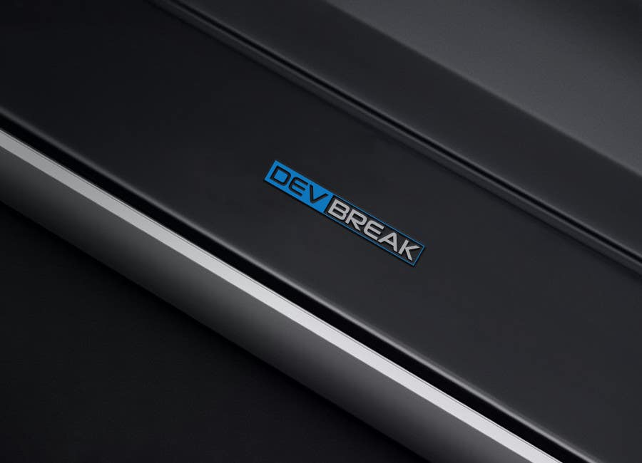
Number 10 – THE WINNER
Very simple but elegant. It catches the eye but at the same time doesn’t scream “Look at me!”. A Logo should be more like an additional nice element, not the most important thing on documents or webpages. The vertical line in the middle also symbolizes a natural break.
We really enjoyed selecting out the best result. We did not expect to get such a huge variety of designs, especially as the price was so low. Yes, it was a hard selection, but at the same time it was entertaining. Half of these logos really made us laugh.
Registering a company
It is very easy to register a company in Estonia. In theory, it takes only a couple of minutes to fill in an online application and voila, it is done. In practice it took a little bit longer until we got to that point, as we first had to decide who will be a CEO, if we should pay the deposit now or should we leave it for the next year etc. The bureaucracy part is no fun.
So, you may wonder how much we had to pay for all of that. The total cost of starting the company was 250€ which included logo, registration, domain and some other small things. Not bad at all 🙂
Check back soon for more blog updates!